top of page

em.br reBrand
Graphic Design
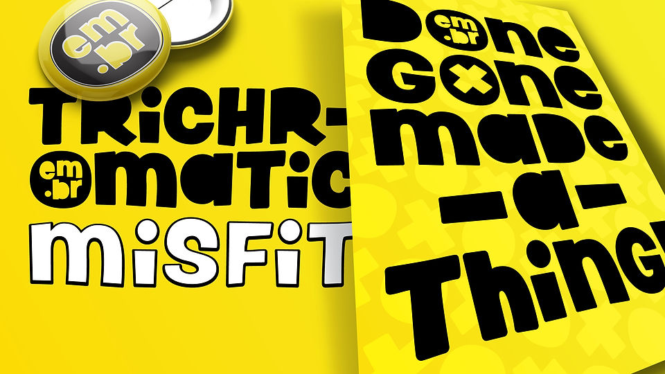
In an effort to update my personal branding a different, more fun approach to the design was chosen to better reflect the kind of work I do.
The yellow colour was chosen for it's bright, striking application alongside the black of the logo. Yellow also represents new life and fun.
It took many months of work to achieve the result. Often I needed weeks between iterations to allow the designs to settle so I could return to it with fresh eyes.
The two-word brand, as taught by notable brand designer Chris Do, is an expression of who I am as a designer. I adopted 'trichromatic misfit' as I believe my eye for colour to be special and I rarely fit in wherever I position myself.


bottom of page